1.2. Widget Definition
Once you have configured the registry it's time to create a widget definitions for one of your components.
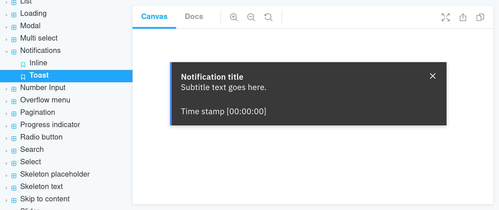
Imagine you have a Toast Notification component, like this one. This is what it looks like in Storybook:
Widget Definition File
Widget definition files are the files matched by the register pattern in the registry
configuration. They usually match the pattern *.widget.js. So if we want to create a widget for the notification, we
will need to create src/components/notification/toast-notification.widget.js. This leaves us with:
src/components/notification/toast-notification.ts
src/components/notification/toast-notification.scss
src/components/notification/toast-notification.widget.js
module.exports = {
  shortcode: 'toast-notification',
  title: 'Toast Notification',
  description: 'A notification element with a bit more context than the inline notification.',
  status: 'wip'
};
All the options are described in the schema and documented in its own documentation site.
Documentation SiteConfigurable Options
One of the most powerful features of widgets is that they allow JS developers to expose component props to CMS editors.
In our Toast Notification example this translate in letting editors choose the title of the notification, the
body, caption, and the notification kind.
These options are defined in the widget definition file. As a widget developer you need to describe the input CMS editors will have available. Then in the render file you will take that eventual editorial input and feed it to the component.
The widget definition file needs to contain the necessary information for the CMS integration to render a form. The CMS
will be responsible to parse the widget registry, take the section for the widget definition, inspect the
settingsSchema property, and present a form to the editor appropriate to collect that input.
The syntax to describe the configurable options is the JSON Schema standard.
Let's add three text boxes and one radio button to collect the Toast Notification options.
module.exports = {
  // entry defaults to 'index.js' but you can change it to any other location.
  // entry: path.join(__dirname, 'render-toast-notification.js'),
  shortcode: 'toast-notification',
  title: 'Toast Notification',
  description: 'A notification element with a bit more context than the inline notification.',
  preview: {
    url: 'https://example.org/storybook/iframe.html?id=widgets-toast-notification-components--default&viewMode=story',
  },
  status: 'wip',
  usesExternalPeerDependencies: ['react', 'react-dom'],
  settingsSchema: {
    type: 'object',
    additionalProperties: false,
    properties: {
      fields: {
        type: 'object',
        required: ['title'],
        properties: {
          title: {
            type: 'string',
            maxLength: 255,
            title: 'Title',
            description: 'Main label for the notification.',
          },
          description: {
            type: 'string',
            title: 'Body',
            description: 'Longer context for the notification message.',
          },
          caption: {
            type: 'string',
            title: 'Caption',
          },
          kind: {
            type: 'string',
            title: 'Notification kind',
            enum: ['success', 'info', 'warning', 'error'],
          },
        },
      },
    },
  },
};
This will end up on the CMS as:
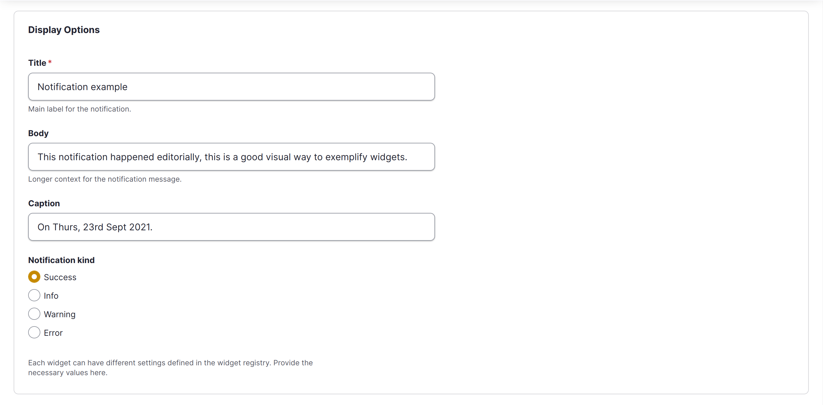
Properties:
shortcodetitledescriptionstatussettingsSchemausesExternalPeerDependencies(string[]): The list of keys of external peer dependencies this widget uses.entry(string): the path to the render file for the component. Default:./index.js.